1
2
3
4
5
6
7
8
9
10
11
12
13
14
15
16
17
18
19
20
21
22
23
24
25
26
27
28
29
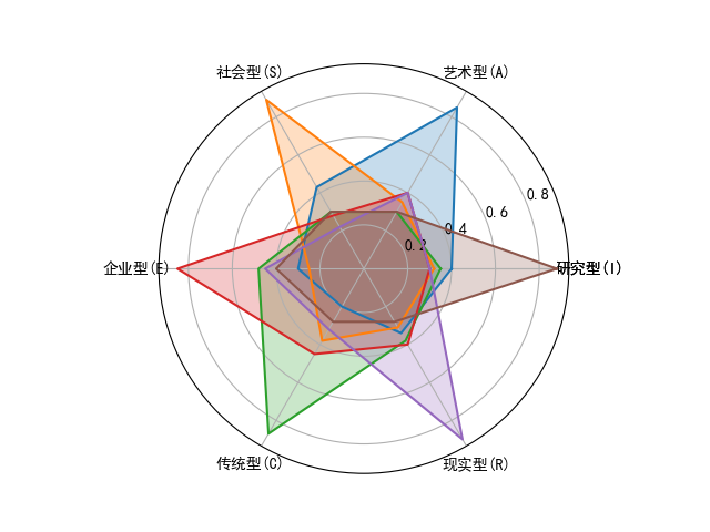
| import numpy as np
import matplotlib.pyplot as plt
plt.rcParams['font.sans-serif'] = ['SimHei']
plt.rcParams['axes.unicode_minus'] = False
dim_num = 6
data = np.array([[0.40, 0.32, 0.35, 0.30, 0.30, 0.88],
[0.85, 0.35, 0.30, 0.40, 0.40, 0.30],
[0.43, 0.89, 0.30, 0.28, 0.22, 0.30],
[0.30, 0.25, 0.48, 0.85, 0.45, 0.40],
[0.20, 0.38, 0.87, 0.45, 0.32, 0.28],
[0.34, 0.31, 0.38, 0.40, 0.90, 0.28]])
angles = np.linspace(0, 2 * np.pi, dim_num, endpoint=False)
angles = np.concatenate((angles, [angles[0]]))
data = np.concatenate((data, [data[0]]))
radar_labels = ['研究型(I)', '艺术型(A)', '社会型(S)',
'企业型(E)', '传统型(C)', '现实型(R)']
radar_label = np.concatenate((radar_labels, [radar_labels[0]]))
plt.polar(angles, data)
plt.thetagrids(angles * 180 / np.pi, labels=radar_label)
plt.fill(angles, data, alpha=0.25)
plt.show()
|