Customization of chart auxiliary elements
1. The auxiliary elements commonly used in charts
Common auxiliary elements include following:
- Coordinate axis: The single coordinate axis can be divided into horizontal coordinate axis (X axis) and vertical coordinate axis (Y axis);
- Title: descriptive text representing the chart.
- Legend: used to indicate the identification method of each group of graphs in the chart.
- Grid: several lines running through the drawing area starting from the scale of the coordinate axis, which are used as the standard for estimating the values shown in the drawing.
- Reference line: a line marking a special value on the coordinate axis.
- Reference area: an area marking a special range on the coordinate axis.
- Annotation text and table: indicates some notes and descriptions of the drawing.
- Table: a table used to emphasize data that is difficult to understand.

2. Sets the label, scale range, and scale label for the axis
2.1 Setting labels for coordinate axes
1 | |

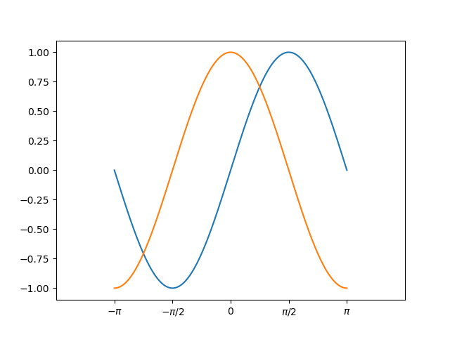
2.2 Set scale range and scale label
1 | |
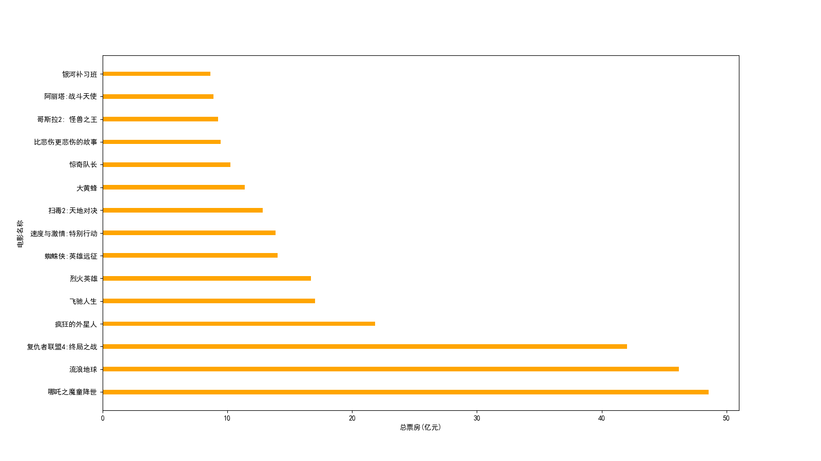
2.3 Demo 1: 2019 Chinese film box office ranking
1 | |
3. Add title and legend
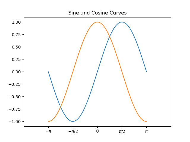
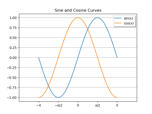
3.1 Add title
1 | |
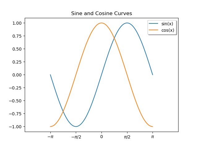
3.2 Add legend
1 | |
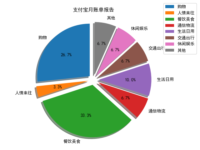
3.3 Demo 2: Alipay monthly bill Report
1 | |
4. Display grid
4.1 Displays the grid of the specified style
1 | |
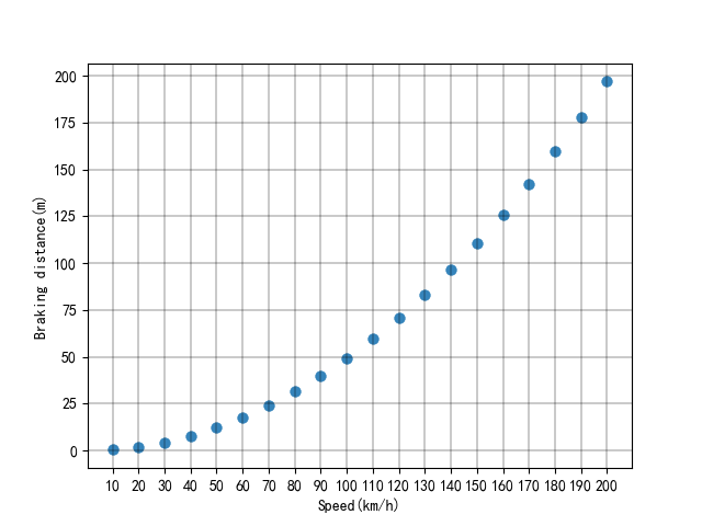
4.2 Demo 3: relationship between vehicle speed and braking distance
1 | |
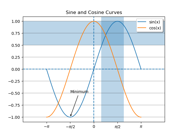
5. Add reference lines and areas
5.1 Add reference line
1 | |
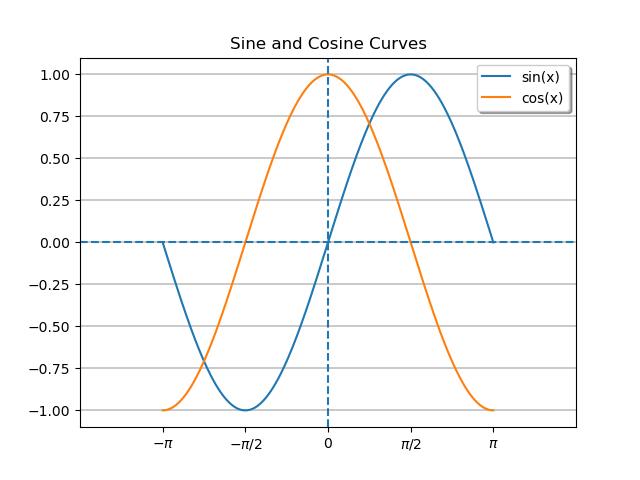
5.2 Add reference area
1 | |

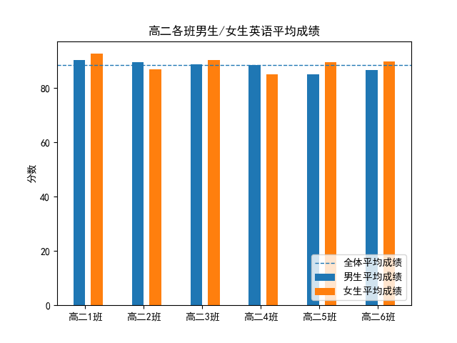
5.3 Demo 4: Evaluation of English performance of boys and girls in all classes of grade two in High School
1 | |
6. Add annotation text
6.1 Add directional annotation text
1 | |
6.2 Add non-directional annotation text
1 | |

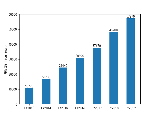
6.3 Demo 5: GMV of Alibaba‘s Taobao and Tmall platforms from 2013 to 2019
1 | |
7. Add table
7.1 Add custom style tables
1 | |
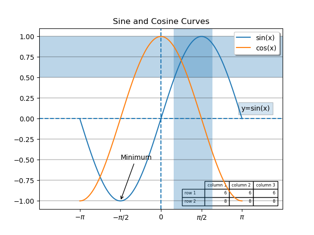
7.2 Demo 6: Proportion of jam bread ingredients
1 | |

Customization of chart auxiliary elements
https://www.hardyhu.cn/2022/03/14/Customization-of-chart-auxiliary-elements/