Beautification of chart style
1. Overview of chart styles
1.1 Default chart styles
1 | |
Common configuration items
| Configuration items | Instructions | The default value |
|---|---|---|
| lines.color | Line color | ‘C0’ |
| lines.linestyle | Line type | ‘-‘ |
| lines.linewidth | Line width | 1.5 |
| lines.marker | Tag line | ‘None’ |
| lines.markeredgecolor | Mark border color | ‘auto’ |
| lines.markeredgewidth | Mark border width | 1.0 |
| lines.markerfacecolor | Tag color | auto |
| lines.markersize | Markup size | 6.0 |
| font.family | The system font | [‘sans-serif’] |
| font.sans-serif | Sans serif font | [‘DejaVu Serif’, ‘Bitstream Vera Serif’, ‘Computer Modern Roman’, ‘New Century Schoolbook’, ‘Century Schoolbook L’, ‘Utopia’, ‘ITC Bookman’, ‘Bookman’, ‘Nimbus Roman No9 L’, ‘Times New Roman’, ‘Times’, ‘Palatino’, ‘Charter’, ‘serif’] |
| font.size | The font size | 10.0 |
| font.style | The font style | ‘normal’ |
| axes.unicode_minus | Uses the Unicode encoded minus sign | True |
| axes.prop_cycle | Property circulator | \cycler(‘color’, [‘#1f77b4’, ‘#ff7f0e’, ‘#2ca02c’, ‘#d62728’, ‘#9467bd’, ‘#8c564b’, ‘#e377c2’, ‘#7f7f7f’, ‘#bcbd22’, ‘#17becf’]) |
| figure.constrained_layout.use | Using constraint layouts | False |
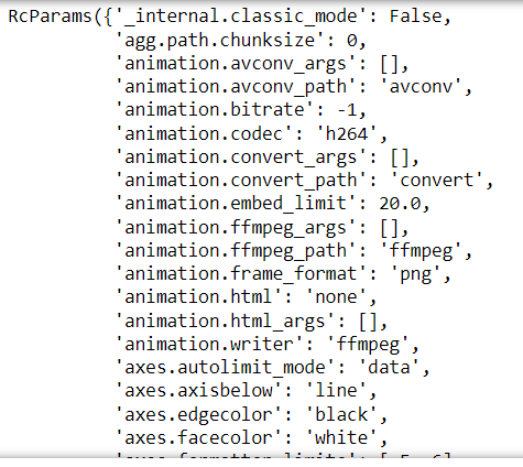
1.2 Chart style modification
1 | |
or:
1 | |
2. Use color
2.1 Use basic color
| Word abbreviation | Word |
|---|---|
| c | cyan |
| m | megenta |
| y | yellow |
| k | black |
| r | red |
| g | green |
| b | blue |
| w | white |
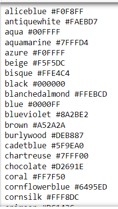
View all colors:
1 | |
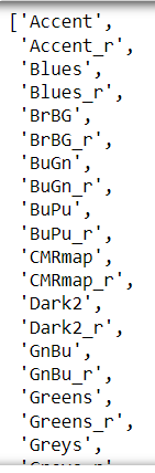
2.2 Using color mapping tables
1 | |
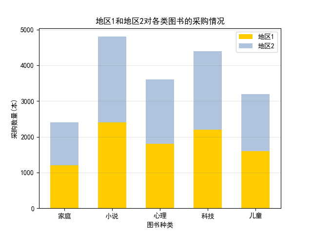
2.3 Demo1: Procurement of different types of books in the two regions
1 | |
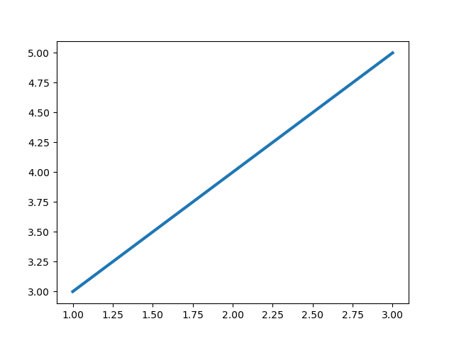
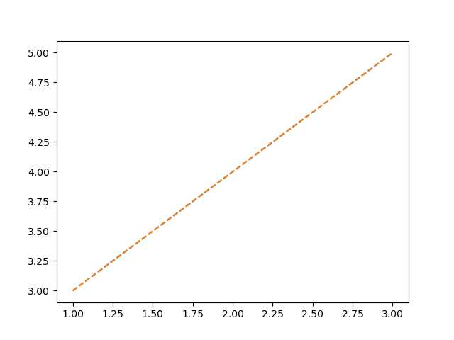
3. Select line type
3.1 Select the type of line
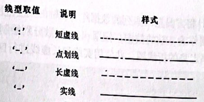
1 | |
or
1 | |
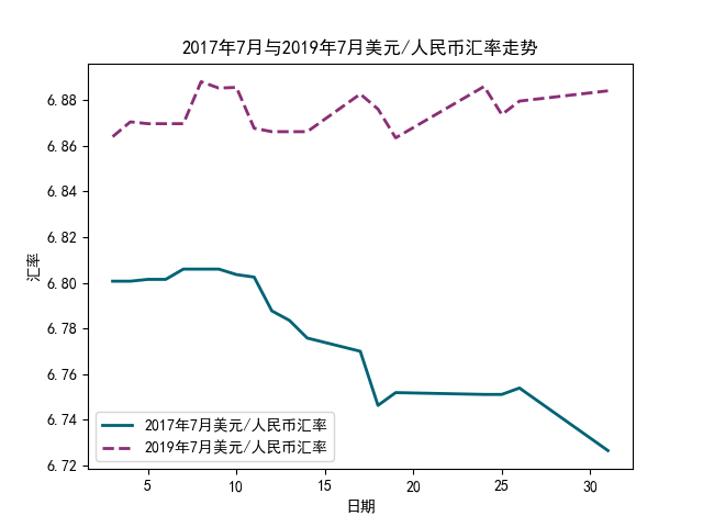
3.2 Demo2: US dollar / RMB exchange rate trend in the international foreign exchange market in July 2017 and July 2019
1 | |
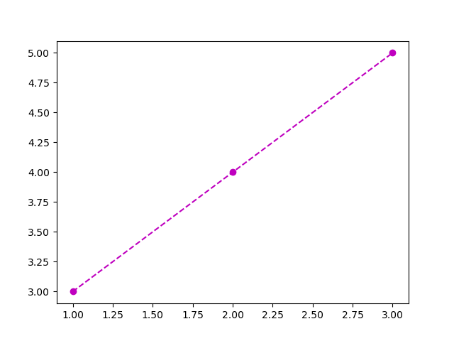
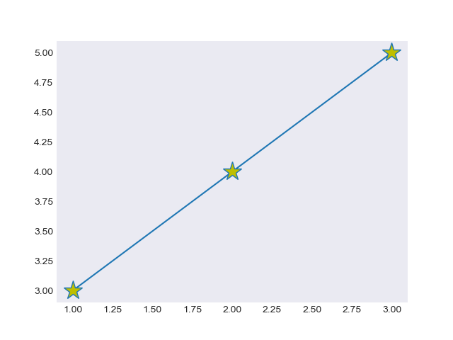
4. Add data marker
4.1 Add data markers for line or scatter charts
matplotlib has many built-in data markers. Using these data markers, you can easily mark the data points for line chart or scatter chart. Data markers can be divided into filled data markers and unfilled data markers.
1 | |
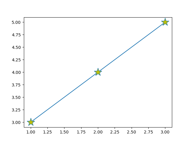
Learn more: matplotlib format string
Format string is a string that quickly sets the abbreviation of the basic style of lines.
[color][marker][linestyle]
1 | |
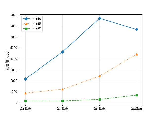
4.2 Demo3: Mark quarterly sales of different products
1 | |
5. Set font
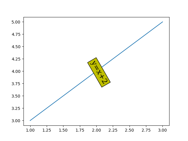
5.1 Set font style
Common properties of the Text class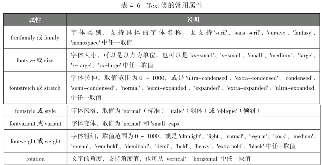
1 | |
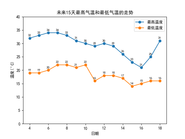
5.2 Demo4: Maximum and minimum temperature in the next 15 days
1 | |
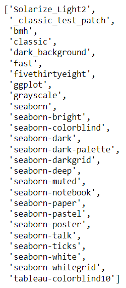
6. Switch theme style
Show available style
1 | |
1 | |
7. Fill area
7.1 Fills the area between polygons or curves
- The fill() function is used to fill the
polygon
1 | |
- The fill_between() function is used to fills the area between two
horizontalcurves
1 | |
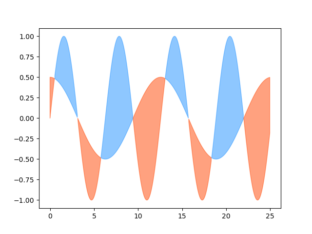
- The fill_betweenx() function is used to fills the area between two
verticalcurves
1 | |
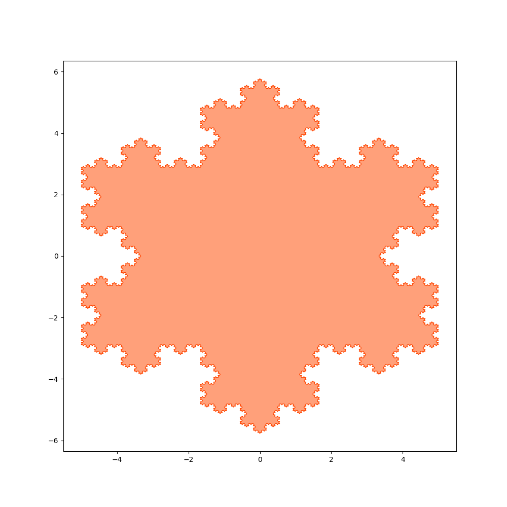
7.2 Demo5: Colored “snowflakes”
1 | |
Beautification of chart style
https://www.hardyhu.cn/2022/03/17/Beautification-of-chart-style/