Sub-graphs and sharing of coordinate axes

1. Draw subgraphs of fixed areas

Schematic diagram of matrix area and numbering

1.1 Draw single subgraph

Using the subplot() function of the pyplot module, you can draw a single subgraph in a planned area.

1
2
3
4
5
6
7
8
9
10
11
import matplotlib.pyplot as plt

# The canvas is divided into 3X2 areas, using the index 6 area
ax_one = plt.subplot(326)
ax_one.plot([1, 2, 3, 4, 5])

# The canvas is divided into 3X1 areas, using the index 2 area
ax_two = plt.subplot(312)
ax_two.plot([1, 2, 3, 4, 5])

plt.show()

Two subplots drawn in succession

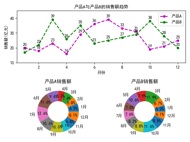
1.2 Demo1: Sales analysis of product A and product B of a factory last year

1
2
3
4
5
6
7
8
9
10
11
12
13
14
15
16
17
18
19
20
21
22
23
24
25
26
27
28
29
30
31
32
33
34
35
36
37
38
import matplotlib.pyplot as plt

plt.rcParams['font.sans-serif'] = ["SimHei"]

x = [x for x in range(1, 13)]
y1 = [20, 18, 23, 16, 29, 36, 39, 33, 31, 19, 21, 25]
y2 = [17, 22, 39, 26, 35, 23, 25, 27, 29, 38, 28, 20]
labels = [str(i) + '月' for i in range(1, 13)]

ax1 = plt.subplot(211)
ax1.plot(x, y1, 'm--o', lw=2, ms=5, label='产品A')
ax1.plot(x, y2, 'g--o', lw=2, ms=5, label='产品B')
ax1.set_title('产品A与产品B的销售额趋势', fontsize=11)
ax1.set_ylim(10, 45)
ax1.set_ylabel('销售额(亿元)')
ax1.set_xlabel('月份')

for xy1 in zip(x, y1):
ax1.annotate("%s" % xy1[1], xy=xy1, xytext=(-5, 5),
textcoords='offset points')
for xy2 in zip(x, y2):
ax1.annotate("%s" % xy2[1], xy=xy2, xytext=(-5, 5),
textcoords='offset points')
ax1.legend()

ax2 = plt.subplot(223)
ax2.pie(y1, radius=1, wedgeprops={'width': 0.5}, labels=labels,
autopct='%3.1f%%', pctdistance=0.75)
ax2.set_title('产品A销售额')

ax3 = plt.subplot(224)
ax3.pie(y2, radius=1, wedgeprops={'width': 0.5}, labels=labels,
autopct='%3.1f%%', pctdistance=0.75)
ax3.set_title('产品B销售额')

# Adjust location
plt.tight_layout()
plt.show()

Sales analysis of product A and product B of a factory last year

1.3 Draw multiple subgraphs

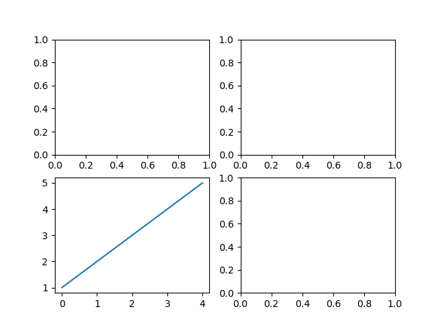
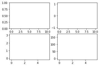
Using the subplots() function of the pyplot module, you can draw multiple subgraphs at a time in all the planned areas.

1
2
3
4
5
6
7
8
9
10
import matplotlib.pyplot as plt

# The canvas is divided into 2X2 areas
fig, ax_arr = plt.subplots(2, 2)

# Use ax_arr 1 rows 0 col element, is meaning 3 area
ax_thr = ax_arr[1, 0]
ax_thr.plot([1, 2, 3, 4, 5])

plt.show()

Draw multiple subgraphs

1.4 Demo2: Analysis on the proportion of people with cats and dogs in some countries

1
2
3
4
5
6
7
8
9
10
11
12
13
14
15
16
17
18
19
20
21
22
23
24
25
26
27
28
29
30
31
32
33
34
35
36
37
38
import matplotlib.pyplot as plt
import numpy as np

# support Chinese
plt.rcParams['font.sans-serif'] = ["SimHei"]


# Add Undirected comment text
def autolabel(ax, rects):
for rect in rects:
width = rect.get_width()
ax.text(width + 3, rect.get_y(), s='{}'.format(width),
ha='center', va='bottom')


y = np.arange(12)
x1 = np.array([19, 33, 28, 29, 14, 24, 57, 6, 26, 15, 27, 39])
x2 = np.array([25, 33, 58, 39, 15, 64, 29, 23, 22, 11, 27, 50])
labels = np.array(['中国', '加拿大', '巴西', '澳大利亚', '日本', '墨西哥',
'俄罗斯', '韩国', '瑞士', '土耳其', '英国', '美国'])

# # The canvas is divided into 1X2 areas
fig, (ax1, ax2) = plt.subplots(1, 2)
barh1_rects = ax1.barh(y, x1, height=0.5, tick_label=labels, color='#FFA500')
ax1.set_xlabel('人群比例(%)')
ax1.set_title('部分国家养猫人群的比例')
ax1.set_xlim(0, x1.max() + 10)
autolabel(ax1, barh1_rects)

barh2_rects = ax2.barh(y, x2, height=0.5, tick_label=labels, color='#20B2AA')
ax2.set_xlabel('人群比例(%)')
ax2.set_title('部分国家养狗人群的比例')
ax2.set_xlim(0, x2.max() + 10)
autolabel(ax2, barh2_rects)

# Adjust the distance between subplots
plt.tight_layout()
plt.show()

Analysis on the proportion of people with cats and dogs in some countries

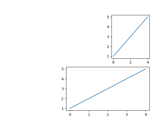
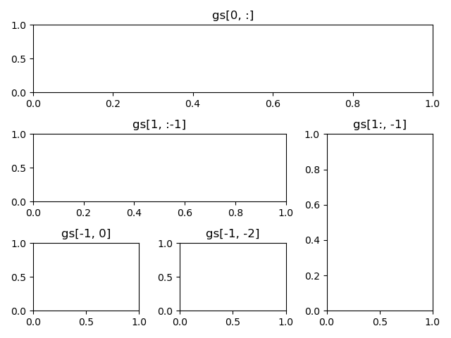
2. Draw subgraphs of custom areas

2.1 Draw single subgraph

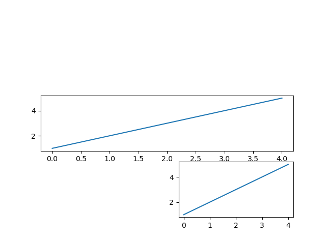
Using the subplot2grid() function of pyplot module, you can plan the whole canvas into areas with unequal layout, and draw a single sub graph in a selected area.

1
2
3
4
5
6
7
8
9
10
11
import matplotlib.pyplot as plt

# The canvas is planned as a 2X3 matrix area, and then a sub-picture is drawn in the area of row 0 and column 2
ax1 = plt.subplot2grid((2, 3), (0, 2))
ax1.plot([1, 2, 3, 4, 5])

# The canvas is planned as a 2X3 matrix area, and then sub-images are drawn in the area of row 0, column 1-2
ax2 = plt.subplot2grid((2, 3), (1, 1), colspan=2)
ax2.plot([1, 2, 3, 4, 5])

plt.show()

Subplots with unequal layout

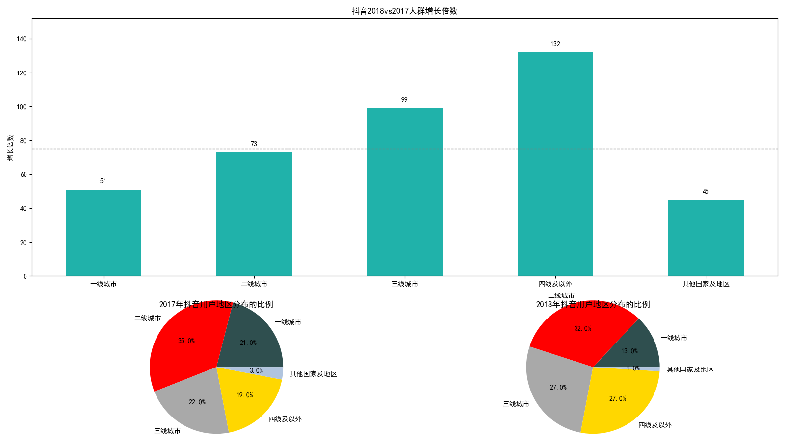
2.2 Demo3: Tiktok user analysis in 2017 and 2018

1
2
3
4
5
6
7
8
9
10
11
12
13
14
15
16
17
18
19
20
21
22
23
24
25
26
27
28
29
30
31
32
33
34
35
36
37
38
39
40
41
42
43
44
45
46
47
48
49
50
51
52
53
54
55
import matplotlib.pyplot as plt
import numpy as np

# support Chinese
plt.rcParams['font.sans-serif'] = ["SimHei"]

data_2017 = np.array([21, 35, 22, 19, 3])
data_2018 = np.array([13, 32, 27, 27, 1])

x = np.arange(5)
y = np.array([51, 73, 99, 132, 45])

labels = np.array(['一线城市', '二线城市', '三线城市', '四线及以外',
'其他国家及地区'])

# Average growth rate
average = 75
bar_width = 0.5


# Add undirected comment text
def autolabel(ax, rects):
for rect in rects:
height = rect.get_height()
ax.text(rect.get_x() + bar_width / 2, height + 3,
s='{}'.format(height), ha='center', va='bottom')


plt.figure(figsize=(16, 9))

# First subgraph
ax_one = plt.subplot2grid((3, 2), (0, 0), rowspan=2, colspan=2)
bar_rects = ax_one.bar(x, y, tick_label=labels, color='#20B2AA',
width=bar_width)
ax_one.set_title('抖音2018vs2017人群增长倍数')
ax_one.set_ylabel('增长倍数')
autolabel(ax_one, bar_rects)
ax_one.set_ylim(0, y.max() + 20)
ax_one.axhline(y=75, linestyle='--', linewidth=1, color='gray')

# Second subgraph
ax_two = plt.subplot2grid((3, 2), (2, 0))
ax_two.pie(data_2017, radius=1.5, labels=labels, autopct='%3.1f%%',
colors=['#2F4F4F', '#FF0000', '#A9A9A9', '#FFD700', '#B0C4DE'])
ax_two.set_title('2017年抖音用户地区分布的比例')

# third subgraph
ax_thr = plt.subplot2grid((3, 2), (2, 1))
ax_thr.pie(data_2018, radius=1.5, labels=labels, autopct='%3.1f%%',
colors=['#2F4F4F', '#FF0000', '#A9A9A9', '#FFD700', '#B0C4DE'])
ax_thr.set_title('2018年抖音用户地区分布的比例')

# Adjust the distance between subplots
plt.tight_layout()
plt.show()

Tiktok user analysis in 2017 and 2018

3. Share coordinate axes of subgraphs

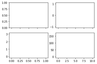
3.1 Sharing the coordinate axes of adjacent subgraphs

When you use the subplots() function to draw subgraphs, you can control whether to share the x-axis or y-axis through the sharex or sharey parameters of the function. The sharex or sharey parameter supports any value of false or ‘none’, true or ‘all’, ‘row’ or ‘col’.

'all' - All subplots share the x-axis 'none' — All subplots do not share the x-axis
'row' - Each row of subplots share the x-axis 'col' - Each column of subplots share the x-axis

1
2
3
4
5
6
7
8
9
10
11
12
13
14
15
16
17
18
19
20
21
22
23
24
25
26
27
28
29
30
import matplotlib.pyplot as plt
import numpy as np

plt.rcParams['axes.unicode_minus'] = False

x1 = np.linspace(0, 2 * np.pi, 400)
x2 = np.linspace(0.01, 10, 100)
x3 = np.random.rand(10)
x4 = np.arange(0.6, 0.5)
y1 = np.cos(x1 ** 2)
y2 = np.sin(x2)
y3 = np.linspace(0, 3, 10)
y4 = np.power(x4, 3)

# share axes-x
fig, ax_arr = plt.subplots(2, 2, sharex='col')

ax1 = ax_arr[0, 0]
ax1.plot(x1, y1)

ax2 = ax_arr[0, 1]
ax2.plot(x2, y2)

ax3 = ax_arr[1, 0]
ax3.scatter(x3, y3)

ax4 = ax_arr[1, 1]
ax4.scatter(x4, y4)

plt.show()

Each column of subplots shares the x-axis

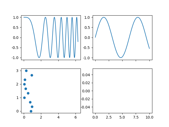
3.2 Shared axes of non adjacent subgraphs

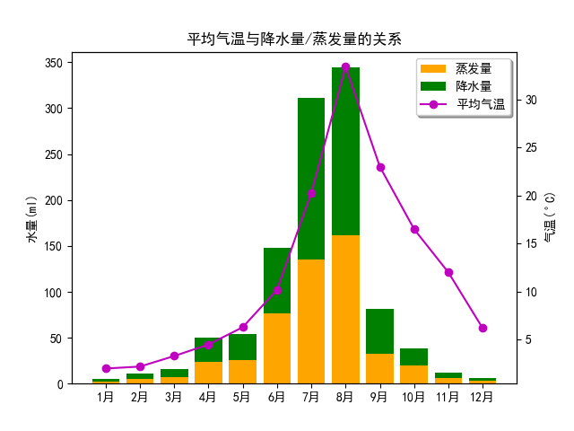
3.3 Demo4: Relationship between annual temperature and water volume in an area

1
2
3
4
5
6
7
8
9
10
11
12
13
14
15
16
17
18
19
20
21
22
23
24
25
26
27
28
29
30
31
32
33
import matplotlib.pyplot as plt
import numpy as np

plt.rcParams['font.sans-serif'] = ["SimHei"]
plt.rcParams['axes.unicode_minus'] = False

month_x = np.arange(1, 13)

# Average temperature
data_tem = np.array([2.0, 2.2, 3.3, 4.5, 6.3, 10.2,
20.3, 33.4, 23.0, 16.5, 12.0, 6.2])
# Precipitation
data_precipitation = np.array([2.6, 5.9, 9.0, 26.4, 28.7, 70.7,
175.6, 182.2, 48.7, 18.8, 6.0, 2.3])
# Evaporation
data_evaporation = np.array([2.0, 4.9, 7.0, 23.2, 25.6, 76.7,
135.6, 162, 32.6, 20.0, 6.4, 3.3])

fig, ax = plt.subplots()
bar_ev = ax.bar(month_x, data_evaporation, color='orange',
tick_label=[str(i) + '月' for i in range(1, 13)])
bar_pre = ax.bar(month_x, data_precipitation,
bottom=data_evaporation, color='green')
ax.set_ylabel('水量(ml)')
ax.set_title('平均气温与降水量/蒸发量的关系')
ax_right = ax.twinx()
line = ax_right.plot(month_x, data_tem, 'o-m')
ax_right.set_ylabel(r'气温($^\circ$C)')

plt.legend([bar_ev, bar_pre, line[0]], ['蒸发量', '降水量', '平均气温'],
shadow=True, fancybox=True)

plt.show()

Relationship between annual temperature and water volume in an area

4. Set layout of subgraphs

4.1 Constrained layout

1
2
3
4
5
6
7
8
9
10
11
12
13
14
15
16
17
import matplotlib.pyplot as plt

fig, axs_arr = plt.subplots(2, 2, constrained_layout=True)

ax_one = axs_arr[0, 0]
ax_one.set_title('Title')

ax_two = axs_arr[0, 1]
ax_two.set_title('Title')

ax_thr = axs_arr[1, 0]
ax_thr.set_title('Title')

ax_fou = axs_arr[1, 1]
ax_fou.set_title('Title')

plt.show()

Subgraph before layout adjustmentSubgraph after layout adjustment

4.2 Compact layout

1
2
3
4
5
6
7
8
9
10
11
12
13
14
15
16
17
18
import matplotlib.pyplot as plt

fig, axs_arr = plt.subplots(2, 2)

ax_one = axs_arr[0, 0]
ax_one.set_title('Title')

ax_two = axs_arr[0, 1]
ax_two.set_title('Title')

ax_thr = axs_arr[1, 0]
ax_thr.set_title('Title')

ax_fou = axs_arr[1, 1]
ax_fou.set_title('Title')

plt.tight_layout()
plt.show()

Subgraph before layout adjustmentSubgraph after layout adjustment

4.3 Custom layout

1
2
3
4
5
6
7
8
9
10
11
12
import matplotlib.pyplot as plt
import matplotlib.gridspec as gridspec

fig2 = plt.figure()
spec2 = gridspec.GridSpec(ncols=2, nrows=2, figure=fig2)

f2_ax1 = fig2.add_subplot(spec2[0, 0])
f2_ax2 = fig2.add_subplot(spec2[0, 1])
f2_ax3 = fig2.add_subplot(spec2[1, 0])
f2_ax4 = fig2.add_subplot(spec2[1, 1])

plt.show()

Use the GridSpec() method to create custom layouts for subplots

1
2
3
4
5
6
7
8
9
10
11
12
13
14
15
16
17
18
19
20
21
22
import matplotlib.pyplot as plt

fig3 = plt.figure()
gs = fig3.add_gridspec(3, 3)

f3_ax1 = fig3.add_subplot(gs[0, :])
f3_ax1.set_title('gs[0, :]')

f3_ax2 = fig3.add_subplot(gs[1, :-1])
f3_ax2.set_title('gs[1, :-1]')

f3_ax3 = fig3.add_subplot(gs[1:, -1])
f3_ax3.set_title('gs[1:, -1]')

f3_ax4 = fig3.add_subplot(gs[-1, 0])
f3_ax4.set_title('gs[-1, 0]')

f3_ax5 = fig3.add_subplot(gs[-1, -2])
f3_ax5.set_title('gs[-1, -2]')

plt.tight_layout()
plt.show()

Use the add_gridspec() method to create custom layouts for subplots

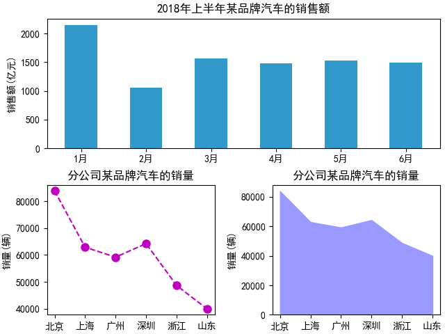
4.4 Demo5: Sales of a brand of cars in the first half of 2018

1
2
3
4
5
6
7
8
9
10
11
12
13
14
15
16
17
18
19
20
21
22
23
24
25
26
27
28
29
import matplotlib.pyplot as plt
import numpy as np

plt.rcParams['font.sans-serif'] = ['SimHei']

x_month = np.array([str(i) + '月' for i in range(1, 7)])
y_sales = np.array([2150, 1050, 1560, 1480, 1530, 1490])
x_citys = np.array(['北京', '上海', '广州', '深圳', '浙江', '山东'])
y_sale_count = np.array([83775, 62860, 59176, 64205, 48671, 39968])

fig = plt.figure(constrained_layout=True)
gs = fig.add_gridspec(2, 2)
ax_one = fig.add_subplot(gs[0, :])
ax_two = fig.add_subplot(gs[1, 0])
ax_thr = fig.add_subplot(gs[1, 1])

ax_one.bar(x_month, y_sales, width=0.5, color='#3299CC')
ax_one.set_title('2018年上半年某品牌汽车的销售额')
ax_one.set_ylabel('销售额(亿元)')

ax_two.plot(x_citys, y_sale_count, 'm--o', ms=8)
ax_two.set_title('分公司某品牌汽车的销量')
ax_two.set_ylabel('销量(辆)')

ax_thr.stackplot(x_citys, y_sale_count, color='#9999FF')
ax_thr.set_title('分公司某品牌汽车的销量')
ax_thr.set_ylabel('销量(辆)')

plt.show()

Sales of a brand of cars in the first half of 2018


Sub-graphs and sharing of coordinate axes
https://www.hardyhu.cn/2022/03/17/Sub-graphs-and-sharing-of-coordinate-axes/
Author
John Doe
Posted on
March 17, 2022
Licensed under