Axis customization

1. Axis overview

1
2
3
4
import matplotlib.pyplot as plt

cur_ax = plt.gca()
print(cur_ax.spines)

Note: Does not display properly

2. Add an axis to any location

1
2
3
4
5
6
7
8
9
10
import matplotlib.pyplot as plt

# plt.axes((left, bottom, width, height) )
ax = plt.axes((0.2, 0.5, 0.3, 0.3))
ax.plot([1, 2, 3, 4, 5])

ax2 = plt.axes((0.6, 0.4, 0.2, 0.2))
ax2.plot([1, 2, 3, 4, 5])

plt.show()

Add an axis to any location

3. Customize scale

3.1 Customize the position and format of the scale

Common subclasses of Locator
Common subclass of date-related Locator
Common subclasses of Formatter
Common subclasses of Formatter related to datetimes

1
2
3
4
5
6
7
8
9
10
11
12
13
14
15
import matplotlib.pyplot as plt

from matplotlib.dates import DateFormatter, HourLocator

ax = plt.gca()
hour_loc = HourLocator(interval=2)
date_fmt = DateFormatter('%Y/%m/%d')

ax.xaxis.set_major_locator(hour_loc)
ax.xaxis.set_major_formatter(date_fmt)

plt.tick_params(labelrotation=30)

plt.tight_layout()
plt.show()

Customize the position and format of the scale

3.2 Customize the style of the scale

1
2
3
4
5
import matplotlib.pyplot as plt

plt.tick_params(direction='out', length=6, width=2, colors='r')

plt.show()

Customize the style of the scale

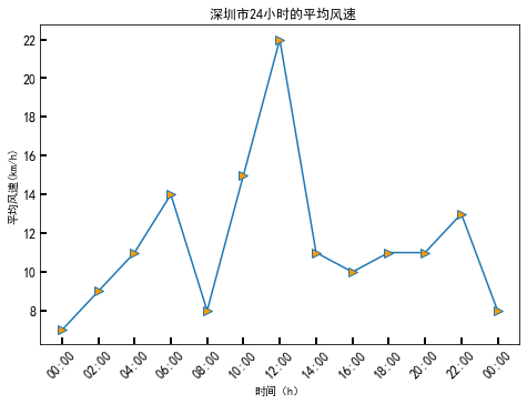
3.3 Demo1: 24-hour average wind speed in Shenzhen

1
2
3
4
5
6
7
8
9
10
11
12
13
14
15
16
17
18
19
20
21
22
23
24
25
26
27
28
29
30
31
import numpy as np
from datetime import datetime
import matplotlib.pyplot as plt
from matplotlib.dates import DateFormatter, HourLocator

plt.rcParams['font.sans-serif'] = ['SimHei']
plt.rcParams['axes.unicode_minus'] = False

dates = ['201910240', '2019102402', '2019102404', '2019102406',
'2019102408', '2019102410', '2019102412', '2019102414',
'2019102416', '2019102418', '2019102420', '2019102422', '201910250']

x_date = [datetime.strptime(d, '%Y%m%d%H') for d in dates]
y_data = np.array([7, 9, 11, 14, 8, 15, 22, 11, 10, 11, 11, 13, 8])

fig = plt.figure()
ax = fig.add_axes((0.0, 0.0, 1.0, 1.0))
ax.plot(x_date, y_data, '->', ms=8, mfc='#FF9900')

# Title label
ax.set_title('深圳市24小时的平均风速')
ax.set_xlabel('时间')
ax.set_ylabel('平均风速(km/h)')

date_fmt = DateFormatter('%H:%M')
ax.xaxis.set_major_formatter(date_fmt)
ax.xaxis.set_major_locator(HourLocator(interval=2))
ax.tick_params(direction='in', length=6, width=2, labelsize=12)
ax.xaxis.set_tick_params(labelrotation=45)

plt.show()

24-hour average wind speed in Shenzhen

4. Hide axis ridge

4.1 Hide all ridge

1
2
3
4
5
6
7
8
9
10
11
import numpy as np
import matplotlib.pyplot as plt
import matplotlib.patches as mpathes

polygon = mpathes.RegularPolygon((0.5, 0.5), 6, 0.2, color='g')
ax = plt.axes((0.3, 0.3, 0.5, 0.5))
ax.add_patch(polygon)

# Hide all ridge
ax.axis('off')
plt.show()

Hide all ridge

4.2 Hide partial spine

1
2
3
4
5
6
7
8
9
10
11
12
13
14
15
import numpy as np
import matplotlib.pyplot as plt
import matplotlib.patches as mpathes

xy = np.array([0.5, 0.5])
polygon = mpathes.RegularPolygon(xy, 5, 0.2, color='y')
ax = plt.axes((0.3, 0.3, 0.5, 0.5))
ax.add_patch(polygon)

# Hide top, left, and right ridges in sequence
ax.spines['top'].set_color('none')
ax.spines['left'].set_color('none')
ax.spines['right'].set_color('none')

plt.show()

Hide partial spine

1
2
3
4
5
6
7
8
9
10
11
12
13
14
15
16
17
18
19
import numpy as np
import matplotlib.pyplot as plt
import matplotlib.patches as mpathes

xy = np.array([0.5, 0.5])
polygon = mpathes.RegularPolygon(xy, 5, 0.2, color='y')
ax = plt.axes((0.3, 0.3, 0.5, 0.5))
ax.add_patch(polygon)

# Hide top, left, and right ridges
ax.spines['top'].set_color('none')
ax.spines['left'].set_color('none')
ax.spines['right'].set_color('none')

# Hide tick
ax.yaxis.set_ticks_position('none')
ax.set_yticklabels([])

plt.show()

Hide tick

4.3 Demo2: 24-hour average wind speed in Shenzhen

1
2
3
4
5
6
7
8
9
10
11
12
13
14
15
16
17
18
19
20
21
22
23
24
25
26
27
28
29
30
31
32
33
34
35
import numpy as np
from datetime import datetime
import matplotlib.pyplot as plt
from matplotlib.dates import DateFormatter, HourLocator

plt.rcParams['font.sans-serif'] = ['SimHei']
plt.rcParams['axes.unicode_minus'] = False

dates = ['201910240', '2019102402', '2019102404', '2019102406',
'2019102408', '2019102410', '2019102412', '2019102414',
'2019102416', '2019102418', '2019102420', '2019102422', '201910250']

x_date = [datetime.strptime(d, '%Y%m%d%H') for d in dates]
y_data = np.array([7, 9, 11, 14, 8, 15, 22, 11, 10, 11, 11, 13, 8])

fig = plt.figure()
ax = fig.add_axes((0.0, 0.0, 1.0, 1.0))
ax.plot(x_date, y_data, '->', ms=8, mfc='#FF9900')

# Title label
ax.set_title('深圳市24小时的平均风速')
ax.set_xlabel('时间')
ax.set_ylabel('平均风速(km/h)')

date_fmt = DateFormatter('%H:%M')
ax.xaxis.set_major_formatter(date_fmt)
ax.xaxis.set_major_locator(HourLocator(interval=2))
ax.tick_params(direction='in', length=6, width=2, labelsize=12)
ax.xaxis.set_tick_params(labelrotation=45)

# Hide upper and right axis ridges
ax.spines['top'].set_color('none')
ax.spines['right'].set_color('none')

plt.show()

24-hour average wind speed in Shenzhen

5. Moving axis ridge

5.1 Move the position of the axis ridge

1
2
3
4
5
6
7
8
9
10
11
12
13
14
15
16
17
18
import numpy as np
import matplotlib.pyplot as plt
import matplotlib.patches as mpathes

xy = np.array([0.5, 0.5])
polygon = mpathes.RegularPolygon(xy, 5, 0.2, color='y')
ax = plt.axes((0.3, 0.3, 0.5, 0.5))
ax.add_patch(polygon)

# Hide the top and right axis ridges
ax.spines['top'].set_color('none')
ax.spines['right'].set_color('none')

# Move the position of the shaft ridge
ax.spines['left'].set_position(('data', 0.5))
ax.spines['bottom'].set_position(('data', 0.5))

plt.show()

Move the position of the axis ridge

5.2 Demo3: Sine and cosine curves

1
2
3
4
5
6
7
8
9
10
11
12
13
14
15
16
17
18
19
20
21
22
23
24
25
26
27
28
29
30
31
32
33
34
35
36
37
import numpy as np
import matplotlib.pyplot as plt

# Support Chinese
plt.rcParams["font.sans-serif"] = ["SimHei"]
plt.rcParams["axes.unicode_minus"] = False

# Data
x_data = np.linspace(-2 * np.pi, 2 * np.pi, 100)
y_one = np.sin(x_data)
y_two = np.cos(x_data)

# Draw
fig = plt.figure()
ax = fig.add_axes((0.2, 0.2, 0.7, 0.7))
ax.plot(x_data, y_one, label='正弦曲线 ')
ax.plot(x_data, y_two, label='余弦曲线 ')
ax.legend()

# Set tick and label
ax.set_xlim(-2 * np.pi, 2 * np.pi)
ax.set_xticks([-2 * np.pi, -3 * np.pi / 2, -1 * np.pi, -1 * np.pi / 2,
0, np.pi / 2, np.pi, 3 * np.pi / 2, 2 * np.pi])
ax.set_xticklabels(['$-2\pi$', '$-3\pi/2$', '$-\pi$', '$-\pi/2$ ', '$0$',
'$\pi/2$', '$\pi$', '$3\pi/2$', '$2\pi$'])
ax.set_yticks([-1.0, -0.5, 0.0, 0.5, 1.0])
ax.set_yticklabels([-1.0, -0.5, 0.0, 0.5, 1.0])

# Hide the right and upper axis ridges
ax.spines['right'].set_color('none')
ax.spines['top'].set_color('none')

# Move the position of the left and lower axis ridges
ax.spines['left'].set_position(('data', 0))
ax.spines['bottom'].set_position(('data', 0))

plt.show()

Sine and cosine curves


Axis customization
https://www.hardyhu.cn/2022/03/25/Axis-customization/
Author
John Doe
Posted on
March 25, 2022
Licensed under