Wechat mini program Tutorial
2.1 Data binding
2.2 Event binding
2.3 Event Passing with Parameters and Data Synchronization
1 | |
1 | |
1 | |
1 | |
1 | |
2.4 Conditional Rendering
2.4.1 wx:if, wx:elif and wx:else
1 | |
1 | |
2.4.2 <block>
Using <block> with wx:if .
Note: <block> is not a component, it is a container with wrapping properties that does not render anything in the page.
1 | |
2.4.3 hidden
1 | |
2.4.4 wx:if vs hidden
wx:if is used to conditionally render an element and its children. If the condition specified in wx:if is true, the element will be rendered; otherwise, it will not be rendered at all. This means that the element and its children will be removed from the DOM if the condition is false. This can be useful for optimizing performance since the removed elements won’t take up any space in the DOM.
On the other hand, hidden is used to conditionally hide an element. If the condition specified in hidden is true, the element will be hidden through CSS (display:none) while still taking up space in the DOM. If the condition is false, the element will be displayed normally.
Therefore, if you want to optimize performance by removing elements that are not needed based on a condition, you should use wx:if. If you just want to show/hide an element without affecting the layout of the page, you should use hidden.
2.5 List rendering
2.5.1 wx:for
1 | |
1 | |
2.5.2 Manually specify the index and variable name
1 | |
2.5.3 wx:key
1 | |
1 | |
2.6 css vs wxss
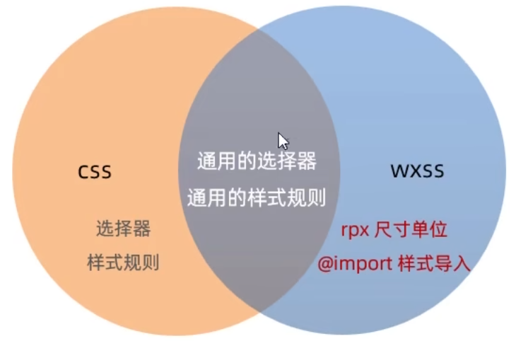
2.7 wxss - rpx
2.7.1 What is the rpx ?
rpx (responsive pixel) is a unit of measurement used in WeChat Mini Programs to make the layout more adaptable to different screen sizes and pixel densities.
2.7.2 The implementation principle of rpx
The implementation of rpx is based on the device’s width in physical pixels (px). On a standard device, 1 rpx equals 1/750 of the screen width in px. This means that if a view element has a width of 750 rpx, it will take up the full width of the screen on a standard device.
2.7.3 Conversion between the units of rpx and px
The conversion between rpx and px units is based on the screen pixel density. In general, 1rpx equals 0.5px on a screen with a standard pixel density of 2x.
2.8 Style import
2.8.1 What is style import
The @import syntax provided by WXSS can be used to import external style sheets.
2.8.2 The syntax format of @import
1 | |
2.9 wss - Global styles and local styles
2.9.1 Global styles
2.9.2 Local styles
2.10 Global Configuration - Common global configurations and components of the mini program
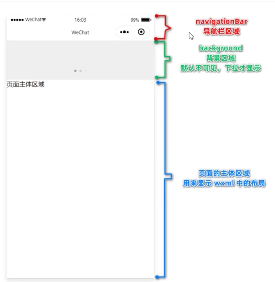
2.11 Global Settings - Window - Navigation Bar
Understand commonly used configuration options for the window node.
| 属性名 | 类型 | 默认值 | 说明 |
|---|---|---|---|
| navigationBarTitleText | String | 字符串 | 导航栏标题文字内容 |
| navigationBarBackgroundColor | HexColor | #000000 | 导航栏背景颜色,如#000000 |
| navigationBarTextStyle | String | white | 导航栏标题颜色,仅支持black/white |
| backgroundColor | HexColor | #ffffff | 窗口的背景色 |
| backgroundTextStyle | String | dark | 下拉loading的样式,仅支持dark/light |
| enablePullDownRefresh | Boolean | FALSE | 是否全局开启下拉刷新 |
| onReachBottomDistance | Number | 50 | 页面上拉触底事件触发时距页面底部距离,单位为px |
2.12 Global Settings - Window - Pull-to-Refresh
2.14 Global Settings - tabBar
2.15 The configuration of WeChat mini program pages
2.16 Data Request - GET and POST Requests
For security reasons, the official guidelines for requesting data interfaces for mini-programs have established the following two restrictions.
- We can only request interfaces of the
HTTPStype. - The domain name of the interface must be added to the list of
trusted sites.

2.16.2 Configure the request domain name to be valid
Requirement Description: Suppose that in my WeChat mini program, I want to request an API under the domain name https://www.escook.cn/.
The configuration steps are as follows: 登录微信小程序管理后台->开发->开发设置->服务器域名->修改request合法域名
2.16.3 Initiate a GET request
1 | |
1 | |
2.16.4 Initiate a GET request
1 | |
1 | |
2.16.5 Request data when the page is first loade
In many cases, we need to automatically request some initialization data when the page is first loaded. In this case, we need to call the function that retrieves the data in the onLoad event of the page.
Here is an example code snippet:
1 | |
2.17 Considerations for making data requests or points to note when making request requests
2.17.1 Skip the validation of the request domain name
If the backend programmer has only provided an interface using the HTTP protocol and has not yet provided an interface using the HTTPS protocol, in order to avoid delaying the development progress, we can temporarily enable the option ‘Do not verify request domain name, TLS version, and HTTPS certificate in the development environment’ in the WeChat developer tool to skip the validation of the request domain name.
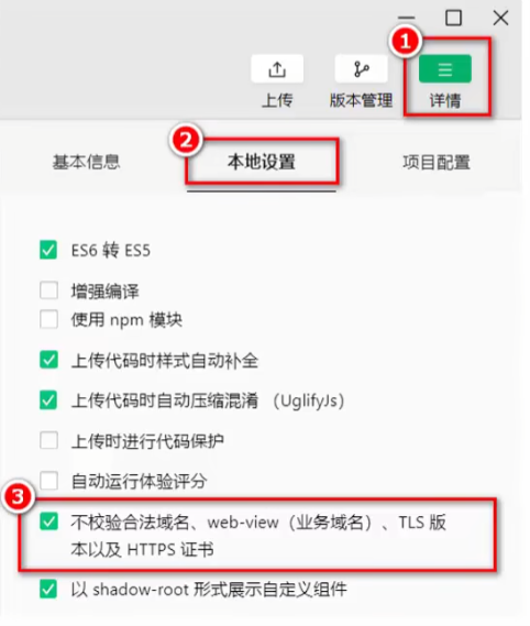
Note: The option to skip the validation of the request domain name is only intended for use during development and debugging stages.
2.17.2 Explanation on Cross-Domain and Ajax
The issue of cross-domain only exists in browser-based web development. Due to the fact that the host environment of a mini program is not a browser, but rather the WeChat client, cross-domain is not a problem in mini programs. The core of Ajax technology relies on the MLHttpReguest object in the browser, but since the host environment of a mini program is the WeChat client, it cannot be referred to as "initiating an Ajax request", but rather "initiating a network data request".
2.18 Case Study: Implementing the Basic Layout for the Local Life Homepage
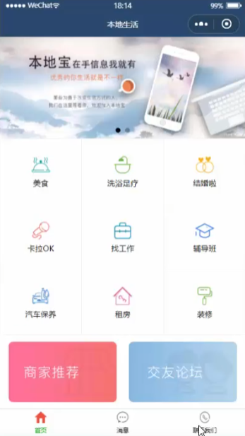
The homepage design and implementation steps:
- Create a new project and organize its structure.
- Configure Navigation Bar Effects.
- Configure tabBar Effects.
- Implement Carousel Effect.
- Implement Nine-Grid Effect.
- Implement Image Layout.
Step 1: Create a new project and organize its structure
1 | |
Step 2: Configure Navigation Bar Effects
1 | |
Step 3: Configure tabBar Effects
1 | |
Step 4: Implement Carousel Effect
Data Definition
1 | |
Lifecycle
1 | |
Implementation Method
1 | |
1 | |
1 | |
Step 5: Implement Nine-Grid Effect
Data Definition
1 | |
Lifecycle
1 | |
1 | |
1 | |
1 | |
Step 6: Implement Image Layout
1 | |
1 | |
3.1 Declarative Navigation
3.1.1 What is page navigation ?
Page navigation refers to the mutual jumping between pages.
For example, there are two ways to implement page navigation in a browser:
<a>link- location.href
3.1.2 There are two ways to implement page navigation in a mini program
Declarative navigation
Declare a<navigator>navigation component on the page, and implement page jumping by clicking on the<navigator>component.Programmatic navigation
Call the navigation API of the mini program to achieve page redirection.
3.1.3 Navigate to tabBar page
The tabBar page refers to the page that has been configured as a tabBar.
When using the <navigator> component to navigate to a specific tabBar page, you need to specify the url and open-type attributes, where:
- The url represents the address of the page to navigate to, and it must start with a forward slash
/. - The
open-typeattribute indicates the type of jump, and it must be set toswitchTab.
The example code is shown below:
1 | |
3.1.4 Navigate to a non-tabBar page
Non-tabBar page refers to a page that has not been configured as a tabBar.
When using the <navigator> component to navigate to a regular non-tabBar page, you need to specify the url and open-type attributes, where:
- The url represents the address of the page to navigate to, and it must start with a forward slash
/. - The
open-typeattribute indicates the type of jump, and it must be set tonavigate.
The example code is shown below:
1 | |
Note: For simplicity, the open-type=”navigate” attribute can be omitted when navigating to a non-tabBar page.
3.1.5 Backward navigation
To navigate back to the previous page or multiple pages, you need to specify the open-type and delta attributes, where:
- The value of the
open-typeattribute must benavigateBack, indicating that a backward navigation is to be performed. - The value of the
deltaattribute must be a number, indicating the level of backward navigation.
The example code is shown below:
1 | |
Note: For convenience, if only backward navigation to the previous page is required, the delta attribute can be omitted, since its default value is 1.
3.2 Programmatic Navigation
3.2.1 Navigate to tabBar page
By calling the wx.switchTab(Object object) method, you can navigate to a tabBar page. The list of properties for the Object parameter object are as follows:
| 属性 | 类型 | 是否必选 | 说明 |
|---|---|---|---|
| url | string | 是 | 需要跳转的tabBar页面的路径,路径后不能带参数 |
| success | function | 否 | 接口调用成功的回调函数 |
| fail | function | 否 | 接口调用失败的回调函数 |
| complete | function | 否 | 接口调用结束的回调函数(调用成功、失败都会执行) |
The example code is shown below:
1 | |
1 | |
3.2.2 Navigate to a non-tabBar page
By calling the wx.navigateTo(Object object) method, you can navigate to a non-tabBar page. The list of properties for the Object parameter object are as follows:
| 属性 | 类型 | 是否必选 | 说明 |
|---|---|---|---|
| url | string | 是 | 需要跳转的tabBar页面的路径,路径后不能带参数 |
| success | function | 否 | 接口调用成功的回调函数 |
| fail | function | 否 | 接口调用失败的回调函数 |
| complete | function | 否 | 接口调用结束的回调函数(调用成功、失败都会执行) |
The example code is shown below:
1 | |
1 | |
3.2.3 Backward navigation
By calling the wx.navigateBack(Object object) method, you can return to the previous page or multiple levels of pages. The list of properties for the Object parameter object are as follows:
| 属性 | 类型 | 默认值 | 是否必选 | 说明 |
|---|---|---|---|---|
| delta | number | 1 | 否 | 返回的页面数,如果delta大于现有页面数,则返回到首页 |
| success | function | 否 | 接口调用成功的回调函数 | |
| fail | function | 否 | 接口调用失败的回调函数 | |
| complete | function | 否 | 接口调用结束的回调函数(调用成功、失败都会执行) |
The example code is shown below:
1 | |
1 | |
3.3 Navigation Parameters
3.3.1 Declarative navigation parameter passing
The “url” attribute of the navigator component is used to specify the path of the page to be navigated to. Additionally, parameters can be included after the path.
- The parameters are separated from the
pathusing a question mark? - The parameter keys are connected to their corresponding values using the equals sign
=. - Multiple
parametersare separated using the ampersand symbol “&”.
The example code is shown below:
1 | |
3.3.2 Passing parameters through programmatic navigation
When invoking the wx.navigateTo(Object object) method to navigate to a page, it is also possible to pass parameters.
An example of the code is shown below:
1 | |
1 | |
3.3.3 Receive navigation parameters in onLoad
The parameters carried by declarative navigation or programmatic navigation can be directly obtained in the onLoad event.
Here is an example code:
1 | |
1 | |
3.4 Pull-to-Refresh
3.4.1 What is pull-to-refresh ?
Pull-to-refresh is a mobile-specific term that refers to the action of reloading page data by pulling down on the screen with a finger swipe gesture.
3.4.2 Enable pull-down refresh
There are two ways to enable pull-to-refresh
Enable pull-to-refresh
globally
In the “window” node ofapp.json, setenablePullDownRefreshtotrue.Enable pull-to-refresh
locally
In theJSONconfiguration file of the page, setenablePullDownRefreshtotrue.
Note: In practical development, it is recommended to use the second method to enable the pull-down refresh effect separately for the required pages.
3.4.3 Configure the style of the pull-down refresh window
In the .json configuration file for the global or page settings, the style of the pull-down refresh window can be customized using backgroundColor and backgroundTextStyle, where:
backgroundColoris used to configure the background color of the pull-down refresh window and only supports hexadecimal color valuesbackgroundTextStyleis used to configure the style of theloadinganimation for the pull-down refresh and only supports dark and light options
Here is an example code:
1 | |
3.4.4 The pull-down refresh event of the page
In the .js file of the page, you can listen to the pull-down refresh event of the current page by using the onPullDownRefresh() function.
Here is an example code:
1 | |
1 | |
1 | |
1 | |
3.4.5 Stop the effect of pulling down to refresh
After handling the pull-down refresh, the loading effect of the pull-down refresh will continue to be displayed and needs to be manually hidden.
You can stop the loading effect of the pull-down refresh on the current page by calling wx.stopPullDownRefresh().
Here is an example code:
1 | |
3.5 Scroll-to-Load
3.5.1 What is pull-up-to-refresh ?
Pull-up-to-refresh is a proprietary term used in mobile devices, referring to the action of loading more data by swiping upwards on the screen with one’s finger.
3.5.2 The pull-up-to-refresh event of the page
In the .js file of the page, the onReachBottom() function can be used to listen for the pull-up-to-refresh event of the current page.
Here is an example code:
1 | |
3.5.3 Configure the distance for the pull-up-to-refresh event
The distance for the pull-up-to-refresh event refers to the distance between the scroll bar and the bottom of the page when the event is triggered.
In the global or page .json configuration file, the onReachBottomDistance property can be used to configure the distance for triggering the pull-up to refresh feature.
The default distance for triggering the “scroll to bottom” event in a mini program is 50 pixels. However, in actual development, this default value can be modified according to the specific needs of the program.
Here is an example code:
1 | |
3.6 Pull-up-to-refresh case - Preliminary implementation of pull-up-to-refresh effect
3.6.1 Case Study Demonstration

3.6.2 The Implementation Steps of the Case Study
- Define a method to obtain a random color
- Retrieve initial data upon page load
- Render the UI structure and enhance the page layout
- Call the method to obtain a random color when scrolling up
- Add a loading prompt effect
- Implement throttling for scrolling up behavior
Step 1: Define a method to obtain a random color
1 | |
1 | |
Step 2: Retrieve initial data upon page load
1 | |
Step 3: Render the UI structure and enhance the page layout
Here is an example code:
1 | |
1 | |
Step 4: Call the method to obtain a random color when scrolling up
Here is an example code:
1 | |
3.7 Pull-up-to-refresh case - Adding loading animation and throttle processing
Step 5: Add a loading prompt effect
Here is an example code:
1 | |
Step 6: Implement throttling for scrolling up behavior
- Defining the ‘
isloadingthrottle in thedatasection
falseindicates that no data request is currently being made.trueindicates that a data request is currently in progress.
- Modify the value of the isLoading throttle in the getColors() method
- Set the throttle to
trueimmediately after calling getColors() - In the complete callback function of the network request, reset the throttle to
false.
- Check the value of the throttle in onReachBottom to control the data request throttling
- If the value of the throttle is
true,blockthe current request. - If the value of the throttle is
false, initiate the data request.
Here is an example code:
1 | |
1 | |
1 | |
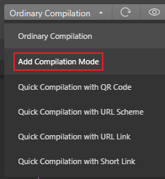
3.8 Extension - Custom Build Modes
3.9 The concept and classification of lifecycles
3.9.1 What is a lifecycle ?
The term “lifecycle” refers to the entire process that an object goes through from creation -> execution -> destruction, emphasizing a specific period of time.
For example:
- Zhang San’s birth marks the beginning of their life cycle.
- Zhang San’s passing represents the end of their life cycle
- Zhang San’s life, from beginning to end, constitutes their life cycle.
We can summarize the process of each mini-program’s execution as its life cycle:
- The launch of a mini-program marks the beginning of its lifecycle.
- The closure of a mini-program marks the end of its lifecycle.
- The process of a mini-program running in between is the lifecycle of the mini-program.
3.9.2 Classification of Lifecycle
In a mini-program, the lifecycle is divided into two categories:
- Application lifecycle
- Refers to the process of the mini-program from start -> run -> destroy
- Page lifecycle
- Refers to the process of loading -> rendering -> destroying of each page in the mini-program.
Among them, the page lifecycle has a smaller scope, while the application lifecycle has a larger scope, as shown in the diagram:

3.10 The concept and classification of lifecycle functions
3.10.1 What are lifecycle functions ?
Lifecycle Functions: These are built-in functions provided by the WeChat mini-program framework that are automatically executed in order according to the lifecycle.
The purpose of lifecycle functions is to allow programmers to perform certain specific operations at specific times. For example, when a page is first loaded, page data can be initialized in the onLoad lifecycle function.
Note that the lifecycle emphasizes a time period, while the lifecycle functions emphasize a specific point in time.
3.10.2 The Classification of Lifecycle Functions
There are two types of lifecycle functions in mini-programs, which are:
- Application lifecycle functions
- Refers specifically to the functions that are called in sequence from start-up -> run -> destruction of the mini-program.
- Page lifecycle functions
- Refers specifically to the functions that are called in sequence from loading -> rendering -> destruction of each page in the mini-program.
3.11 The lifecycle functions of applications and pages
3.11.1 The lifecycle functions of the application
Here is an example code:
1 | |
3.11.2 The lifecycle functions of pages
Here is an example code:
1 | |
3.12 The concept of wxs
3.12.1 What is wxs ?
WXS (WeiXin Script) is a unique scripting language for mini-programs that, when combined with WXML, can be used to construct the structure of a page.
3.12.2 The application scenarios of wxs
Functions defined in .js files cannot be called in wxml, but functions defined in wxs can be called in wxml. Therefore, a typical use case for wxs in WeChat mini-programs is as a “filter”.
3.12.3 The relationship between wxs and JavaScript
Although the syntax of wxs is similar to JavaScript, wxs and JavaScript are completely different languages:
wxs has its own data types
- number
- string
- boolean
- object
- function
- array
- date
- regexp
wxs does not support syntax forms similar to ES6 and above
- Not supported: let, const, destructuring assignment, spread operator, arrow function, object property shorthand, etc…
- Supported:var for defining variables, regular functions, and other syntax similar to ES5
wxs follows the CommonJS specification
- module object
- require() function
- module.exports object
3.13 The basic usage of wxs
3.13.1 Embedding wxs scripts
wxs code can be written in the <wxs> tag within WXML files, just like how JavaScript code can be written in the <script> tag within HTML files.
Each <wxs>``</wxs> tag in a WXML file must provide a module attribute to specify the module name for the current WXS, making it easier to access members within the module in the WXML file.
Here is an example code:
1 | |
3.13.2 Define an external linked wxs script
WXS code can also be written in files with the .wxs extension, just like how JavaScript code can be written in files with the .js extension.
Below is an example code in a file named tools.wxs:
1 | |
3.13.3 Using external wxs scripts
When importing external wxs scripts in wxml, it is mandatory to add the module and src attributes to the <wxs> tag, where:
- module specifies the name of the module
- src specifies the relative path of the script to be imported.
1 | |
3.13.4 Characteristics of WXS
1. Different from JavaScript
To reduce the learning cost of wxs (WeiXin Script), the wxs language borrowed a lot of syntax from JavaScript in its design. However, fundamentally speaking, wxs and JavaScript are two completely different languages!
2. Cannot be used as component event callbacks
The typical use case for wxs is as a “filter“, often used in conjunction with Mustache syntax, for example:
1 | |
However, functions defined in wxs cannot be used as event callback functions for components. For example, the following usage is incorrect:
1 | |
3. Isolation
Isolation means that the runtime environment of wxs is isolated from other JavaScript code. This is reflected in the following two aspects:
- wxs cannot call functions defined in js
- wxs cannot call APIs provided by mini-programs
4. Good performance
- On iOS devices, WXS in mini-programs is 2-20 times faster than JavaScript code
- On Android devices, there is no difference in their running efficiency.”
3.14 Example - Demonstrate the effect of the case and implement navigation jumping
- Page navigation and parameter passing
- Load the next page data when pulling up to the bottom
- Refresh the list data when pulling down
1 | |
1 | |
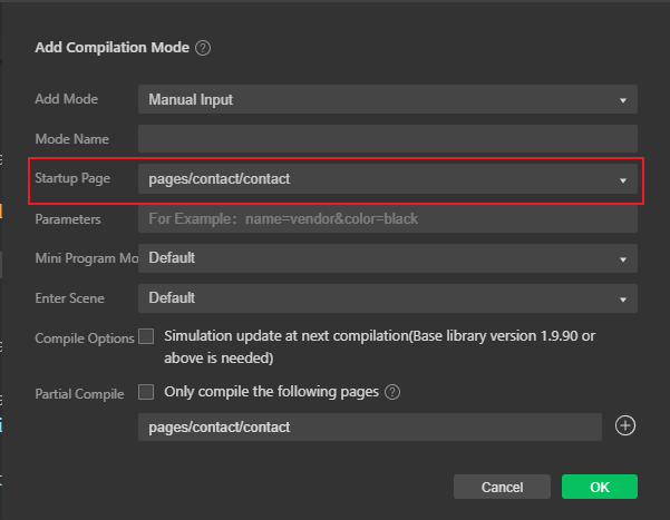
3.15 Example - Set the title content and create a compilation mode
Here is an example code:
1 | |
3.16 Example - Obtain and render data for the list of shops
Load the data of the shop list under the specified category in the form of pagination:
- Interface address
- https://applet-base-api-t.itheima.net/categories/:cate_id/shops
- :cate_id in the URL address is a dynamic parameter that represents the Id of the category.
- Request method
- GET request
- Request parameters
- _page indicates which page of data to request.
- _limit indicates how many pieces of data to request per page.
1 | |
1 | |
1 | |
1 | |
3.17 Example - Preliminarily implement the effect of pulling up to load
1 | |
1 | |
1 | |
3.18 Example - Determine whether the data has been fully loaded
If there is no next page, the triggering of bottom loading will stop.
The formula for determining whether there is still data on the next page is:
“Page number value * number of items per page >= total number of items”. If the result is “true”, then there is no more data on the next page.
1 | |
3.19 Example - Implement the function of pulling down to refresh
1 | |
1 | |
3.20 Use WXs to process phone numbers
1 | |
1 | |
4. WeChat Mini-Program Components and Package Splitting
Goal:
- Know how to customize WeChat Mini-Program components
- Understand the role of behaviors in components
- Know how to install and configure the vant-weapp component library
- Know how to use MobX to achieve global data sharing
- Know how to convert APIs into Promises
4.2 The creation and referencing of components
4.2.1 Create components
- In the root directory of the project, right-click the mouse and create a components -> test folder.
- Right-click on the newly created components -> test folder and click on “New Component“.
- After typing in the name of the component and pressing enter, four files corresponding to the component will be automatically generated with the file extensions .js, .json, .wxml, and .wxss.
Note: To maintain a clear directory structure, it is recommended to store different components in separate directories, for example: “components/header”, “components/footer”, etc.
4.2.2 Referencing components
The referencing of components can be categorized into ‘local referencing’ and ‘global referencing’, which are self-explanatory:
- Local referencing: Components can only be used within the page where they are referenced
- Global referencing: Components can be used in every page of the mini-program
4.2.3 Local referencing of components
1 | |
1 | |
4.2.4 Global referencing of components
1 | |
4.2.5 Global referencing vs. local referencing
Select the appropriate referencing method based on the frequency of use and scope of the component:
- If a component is frequently used across multiple pages, it is recommended to use ‘global referencing’.
- If a component is only used in specific pages, it is recommended to use ‘local referencing’.
4.2.6 The differences between components and pages
At first glance, both components and pages are composed of four files: .js, .json, .wxml, and .wxss. However, the .js and .json files of components and pages differ significantly:
- The .json file of a component needs to declare the “component”: true property.
- The .js file of a component calls the Component() function.
- The event handling functions of a component need to be defined in the methods node.
4.3 Customize the style of the component
4.3.1 Component Style Isolation
By default, the styles of custom components only apply to the current component and do not affect the UI structure outside of the component, as shown in the figure below:
- The style of component A will not affect the style of component C.
- The style of component A will not affect the style of the WeChat mini-program page.
- The style of the WeChat mini-program page will not affect the styles of components A and C.
Benefits:
- It prevents external styles from affecting the internal styles of the component.
- It prevents the styles of the component from breaking the external styles.