Mastering Common Flexbox Layouts with Tailwind CSS
Flexbox is a powerful CSS layout module that makes it easy to design flexible and responsive layouts.
When combined with Tailwind CSS, a utility-first CSS framework, you can create complex layouts with minimal code.
In this blog post, we’ll explore some of the most commonly used Flexbox layouts and how to implement them using Tailwind CSS.
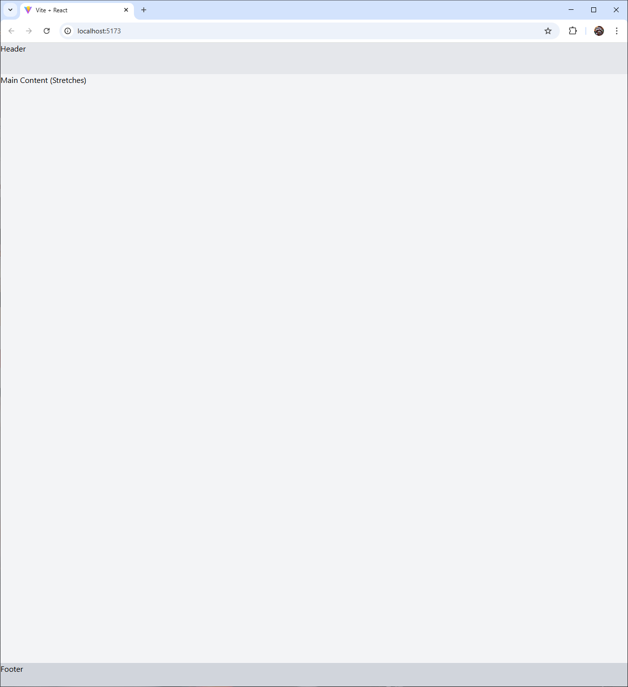
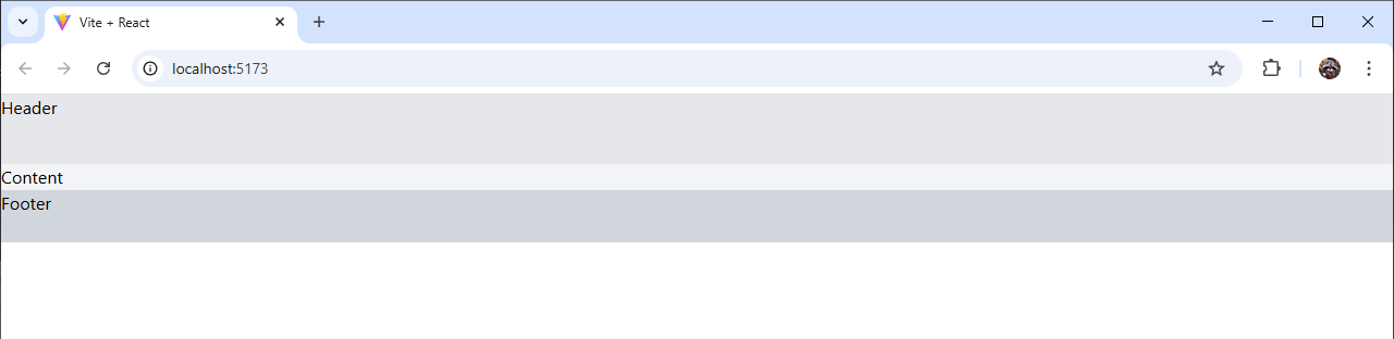
1. Vertical Stack with Stretchable Bottom Element
This layout is perfect for scenarios where you have a fixed header and footer, with a content area that stretches to fill the remaining space.
1 | |
flex flex-col: Enables Flexbox with a vertical (column) direction.h-screen: Sets the container to full viewport height.h-16andh-12: Fixed heights for the header and footer.flex-1: Allows the main content to grow and fill the remaining space.
This is ideal for dashboards, single-page applications, or chat interfaces where the message area needs to expand.
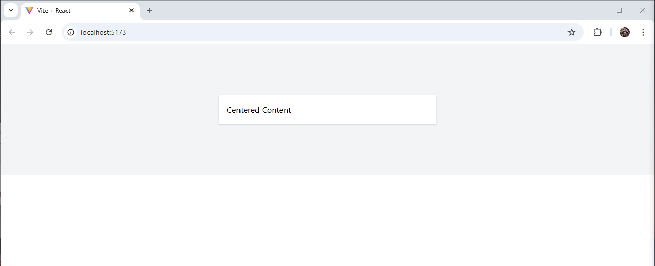
2. Horizontal Centered Layout
A classic layout for centering content horizontally, often used for navigation bars or card layouts.
1 | |
flex: Enables Flexbox with default row direction.justify-center: Centers children horizontally.items-center: Centers children vertically.h-64: Sets a fixed height (16rem/256px) for demonstration.w-1/3: Makes the inner div one-third of the parent width.
Use this for login forms, hero sections, or any content that needs to be perfectly centered.
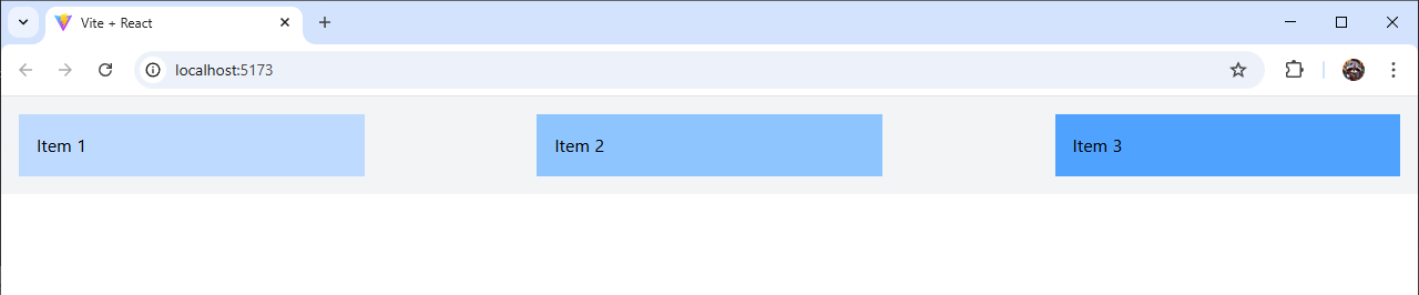
3. Evenly Spaced Grid
This layout distributes items evenly across a row, great for galleries or feature lists.
1 | |
justify-between: Distributes items with equal space between them.w-1/4: Sets each item to 25% width.p-4: Adds padding for spacing.
Alternatively, use justify-around for space around items or justify-evenly for equal spacing on all sides.
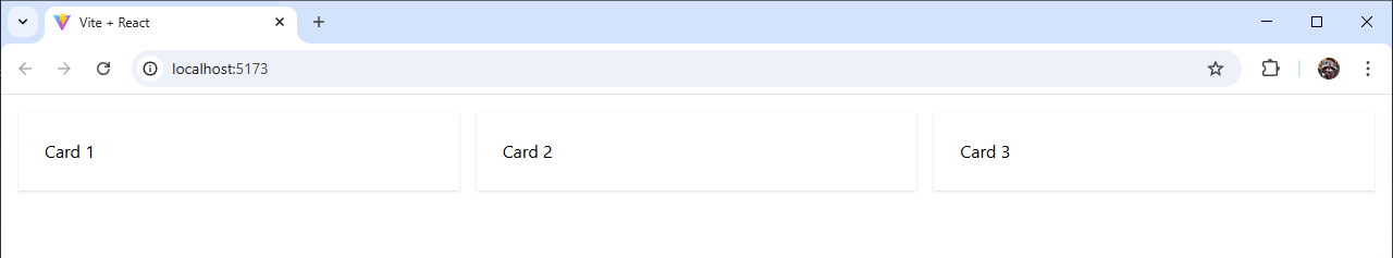
4. Responsive Card Layout
A flexible layout that stacks cards on mobile and aligns them in a row on larger screens.
1 | |
flex-col md:flex-row: Stacks vertically by default, switches to horizontal at medium (md) breakpoint.gap-4: Adds consistent spacing between items (1rem/16px).flex-1: Makes each card grow equally to fill available space.
This is perfect for product listings or feature comparisons that need to adapt to different screen sizes.
5. Sticky Footer
A layout where the footer stays at the bottom of the page, even with minimal content.
1 | |
min-h-screen: Ensures the container is at least full viewport height.flex-1on main: Allows the content area to expand, pushing the footer down.
This ensures your footer is always at the bottom, regardless of content length.
Tips for Using Flexbox with Tailwind CSS
Control Growth and Shrinkage:
flex-grow-0orflex-grow-1: Control if an item grows.flex-shrink-0: Prevent shrinking when space is limited.
Alignment Options:
justify-start,justify-end,justify-center, etc., for horizontal alignment.items-start,items-center,items-endfor vertical alignment.
Responsive Design:
- Use prefixes like
sm:,md:,lg:to adjust layouts at different breakpoints.
- Use prefixes like
Spacing:
- Leverage
gap-classes instead of margins for consistent spacing.
- Leverage